


VISUAL IDENTITY / BRAND POSITIONING / BRAND STRATEGY / PACKAGING
With a desire to enter the international market and go further into the central Europe, I was commissioned to rejuvenate San Giusto’s visual identity. This included the branding system, packaging design, art direction, stationery and basic elements of the communication tools
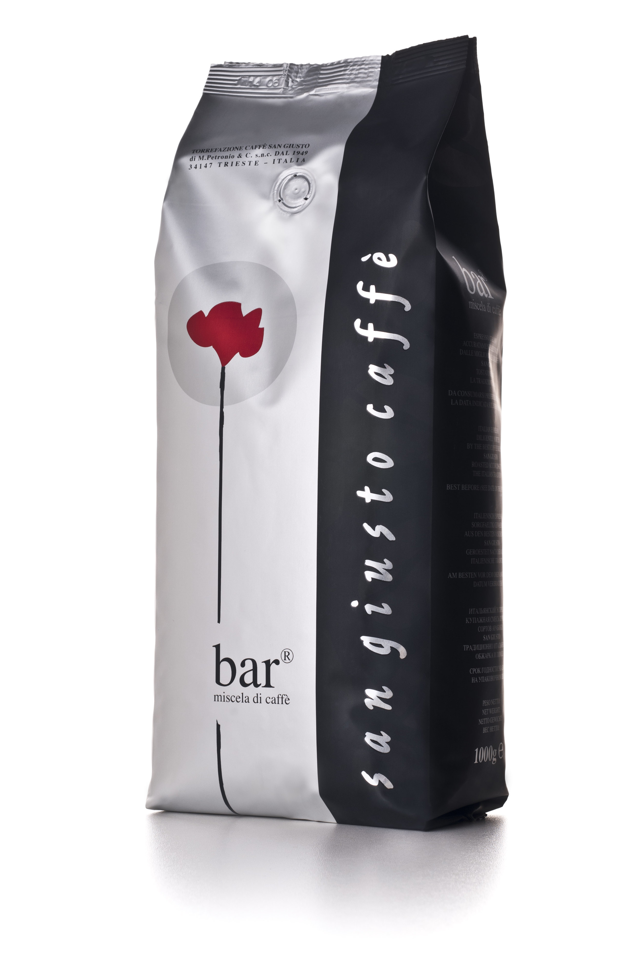
An Italian small-batch coffee roastery brand, needed a powerful and unique brand identity in order to expand on global market competing with the other big HORECA players. By creating a new symbol, a irregular stylised flower, we designed an original and fresh disruptive element. Inspired by the look of raw coffee bean, it’s red colour undoubtedly communicated their commitment to methodically sourcing, roasting and preparing the highest quality beans, whilst using the traditional colour of Trieste, a world capital of espresso coffee.