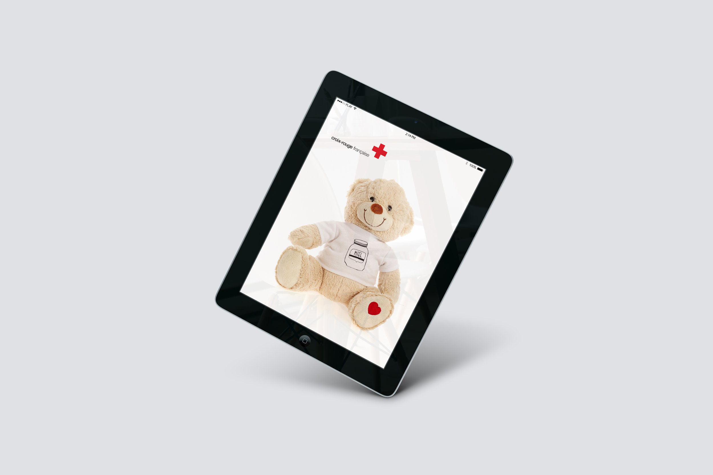
Red Cross France
VISUAL IDENTITY / BRAND POSITIONING / BRAND STRATEGY / BRAND ARCHITECTURE / PACKAGING
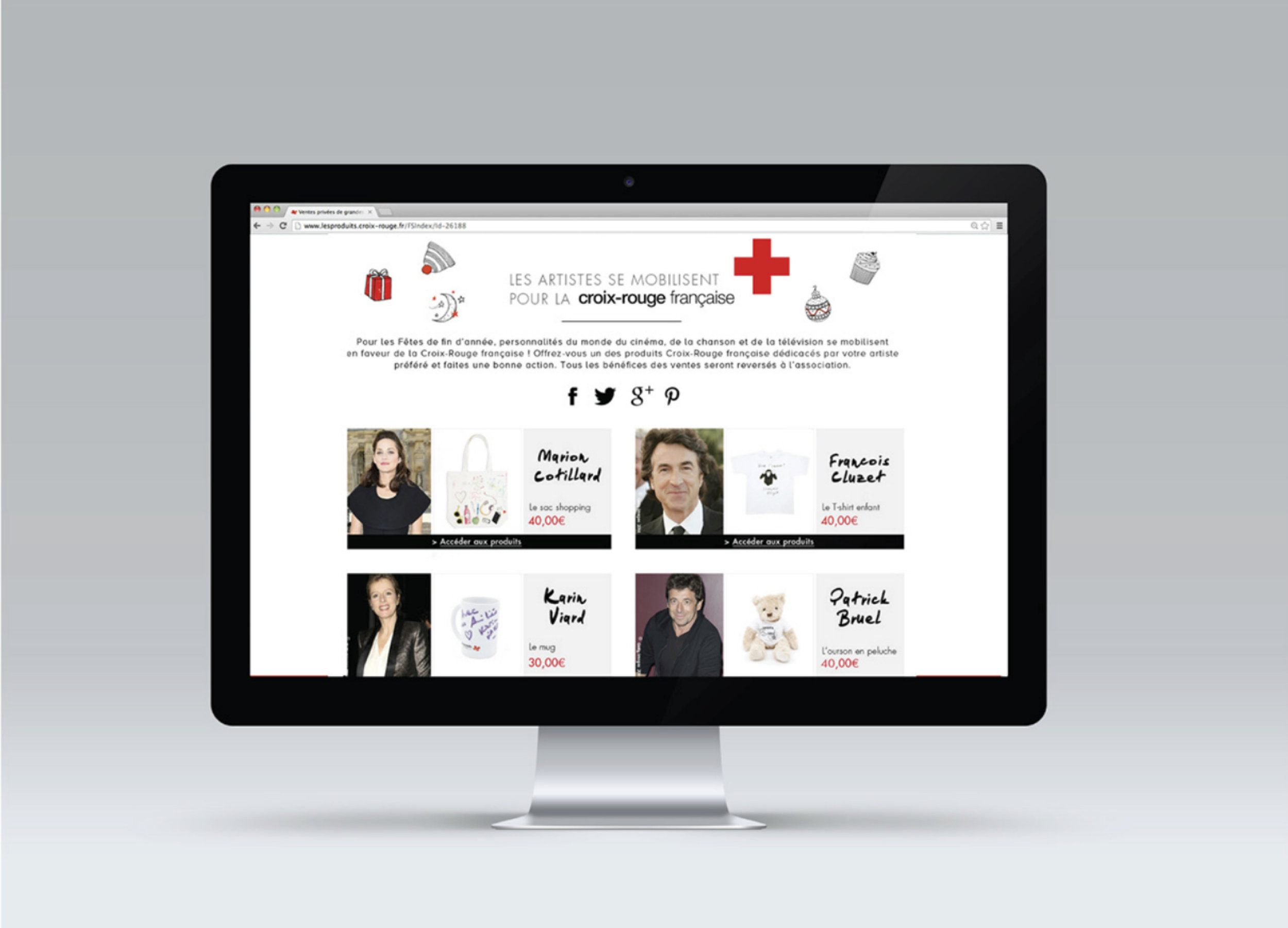
With France facing a severe economic crisis, the French Red Cross needed to come up with a fresh way to convince consumers to donate to the cause. By creating the first Red Cross product range with strong emotional power, we succeed in reaching a larger audience and making donations more spontaneous.
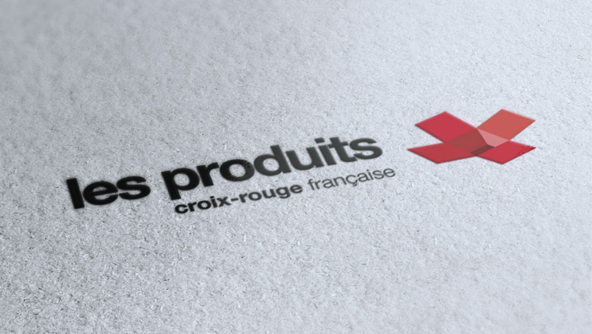
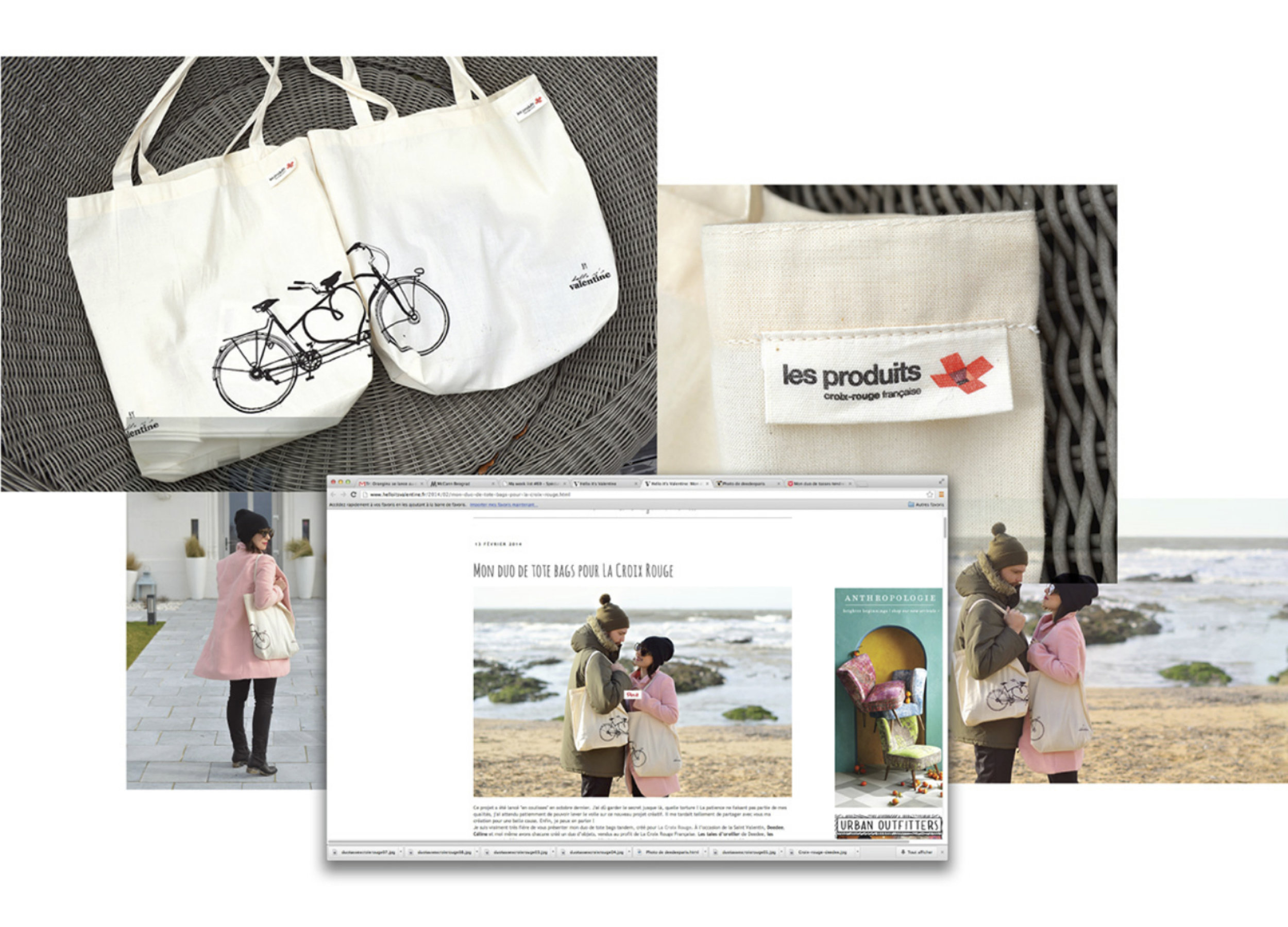
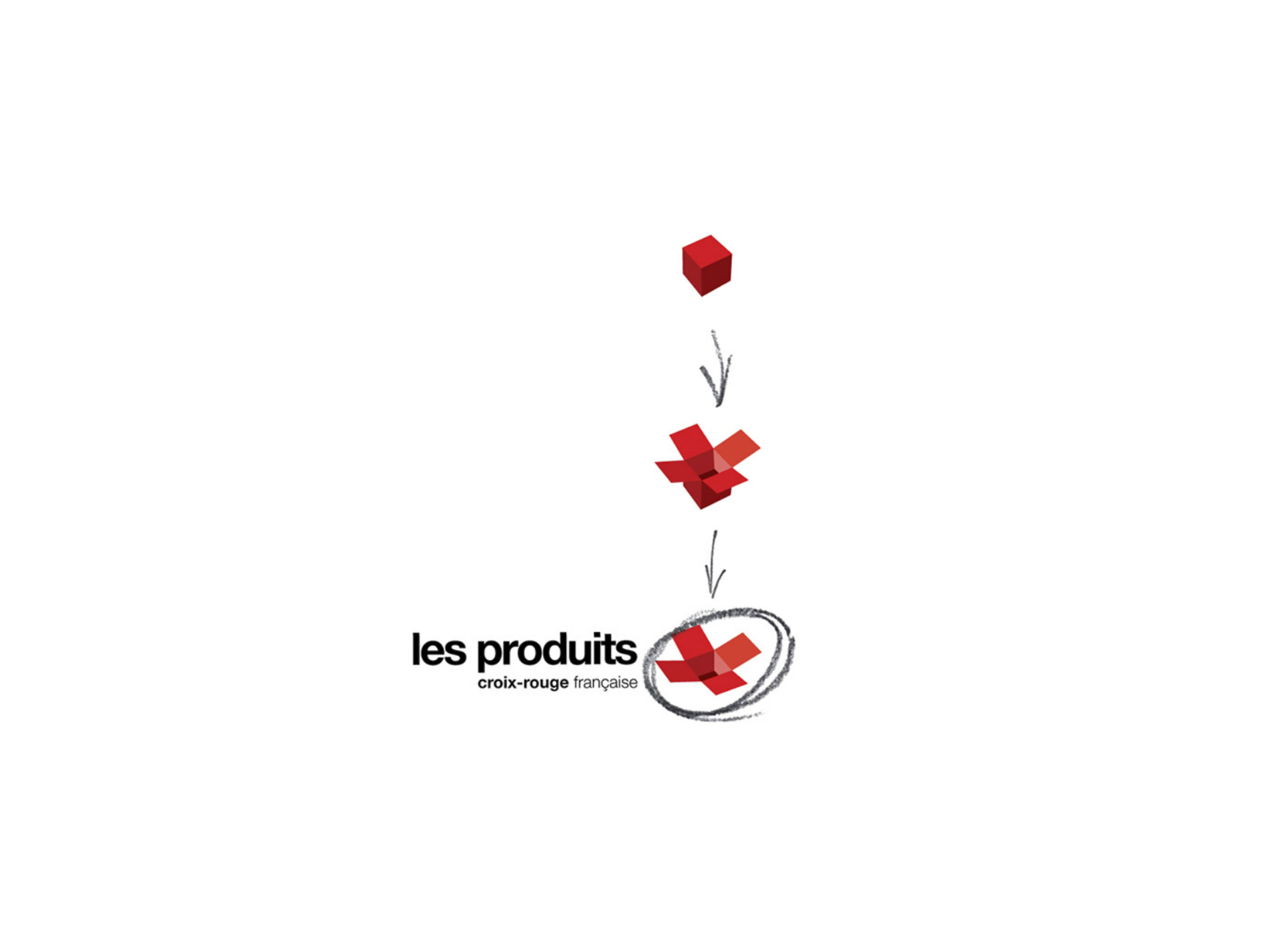
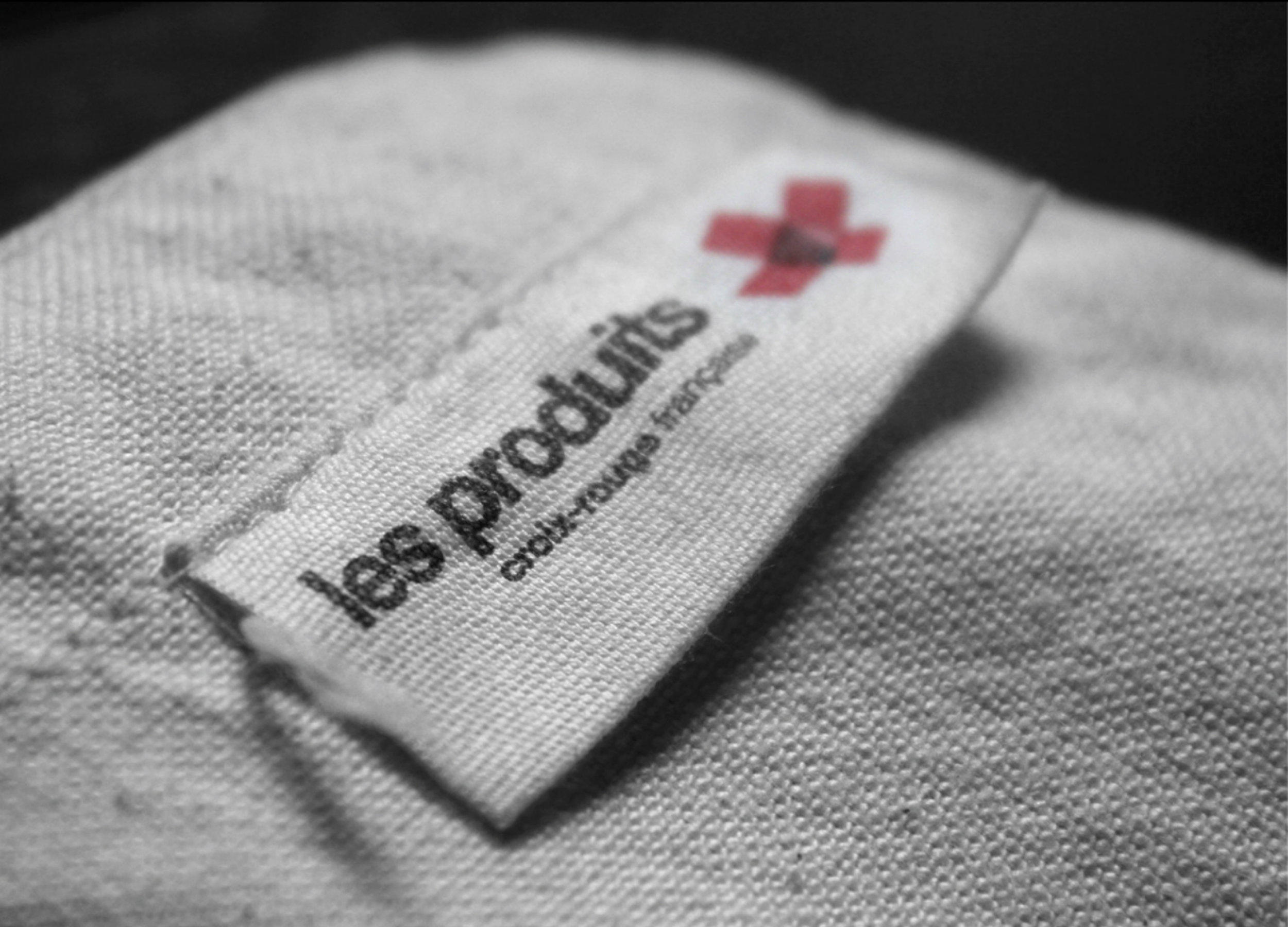
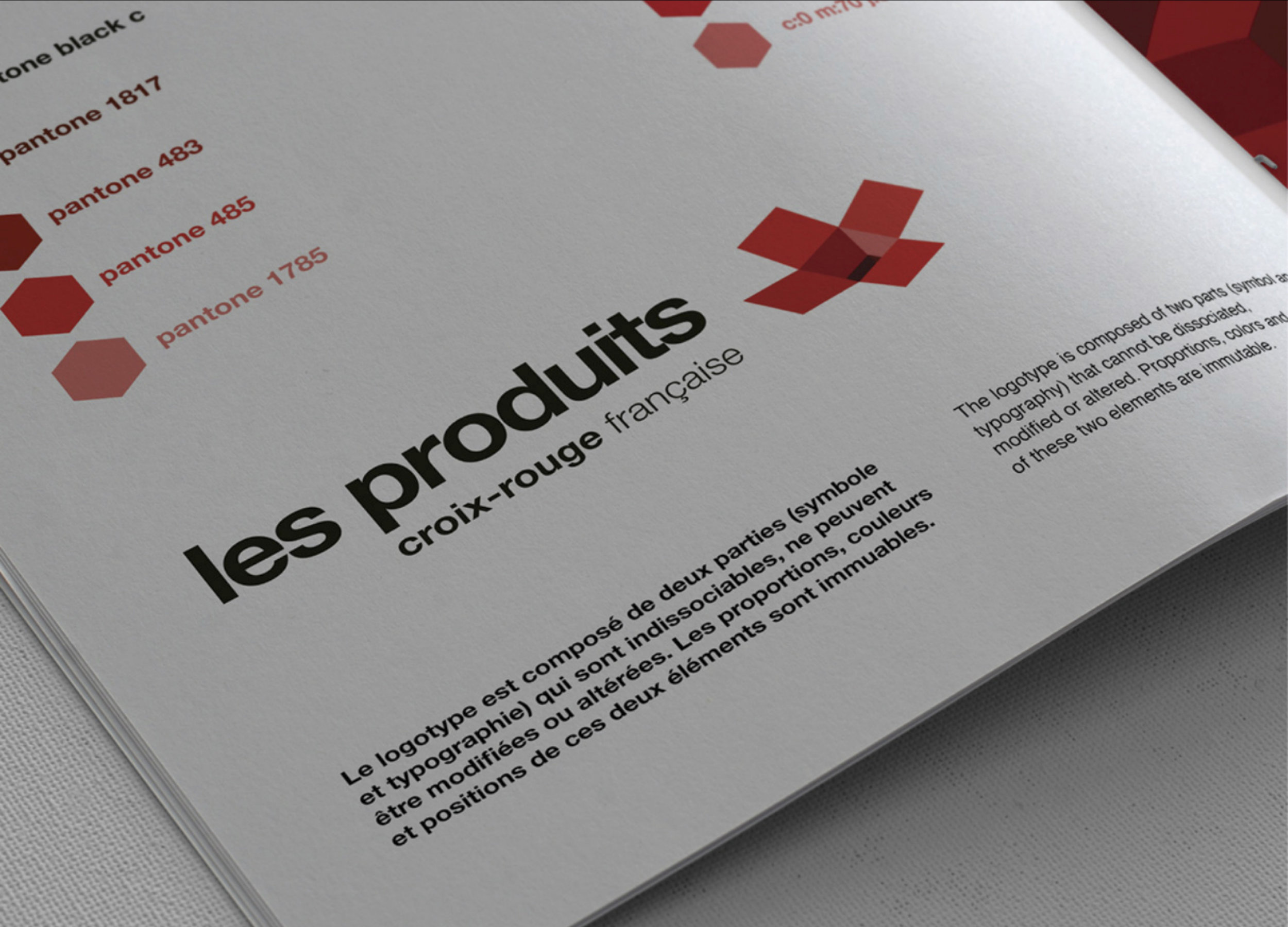
The logo itself represent the unfolded red box creating a strong visual connection with the Red Cross logo. It is accompanied with wordmark in bold sans serif typography.
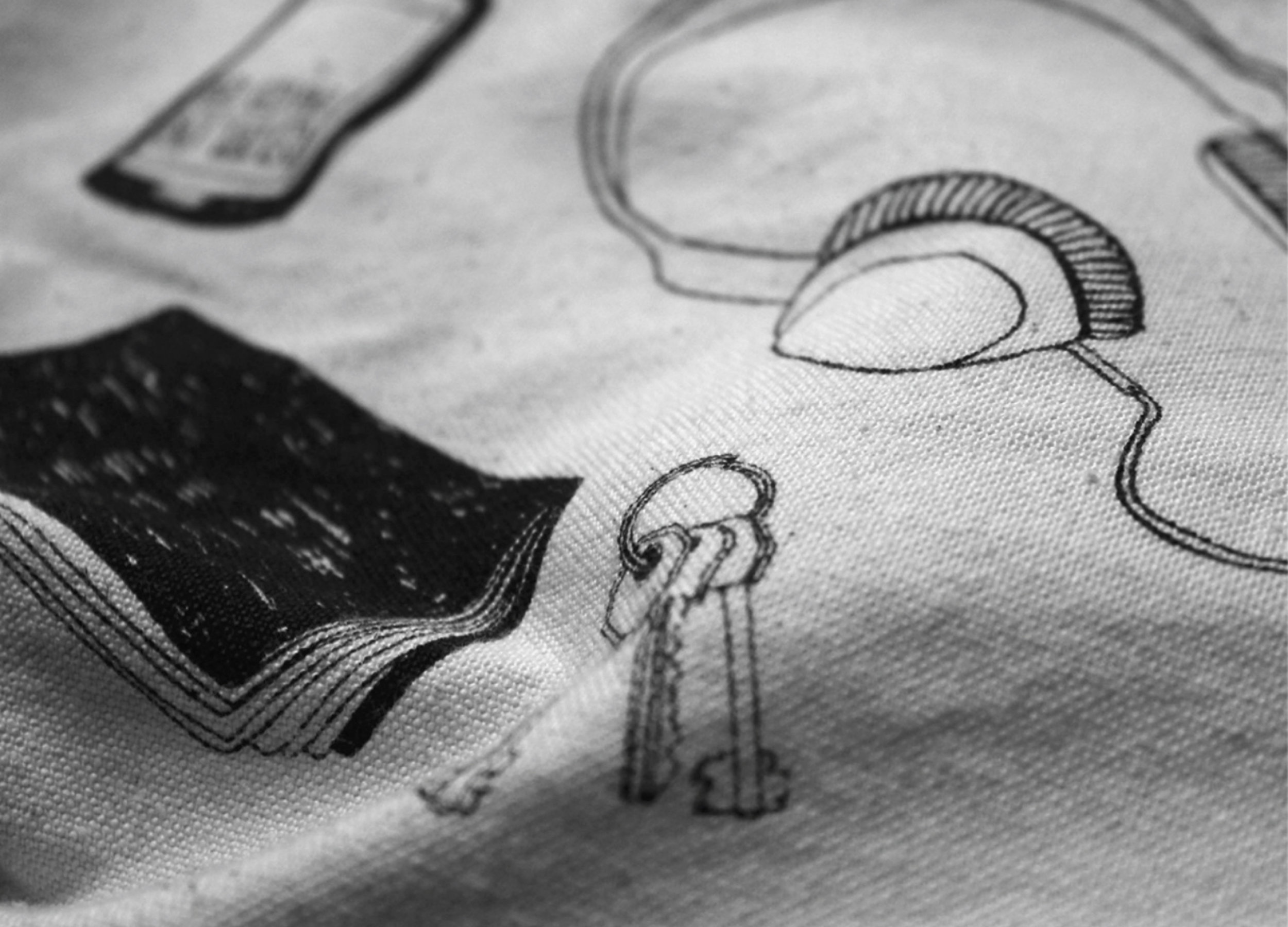

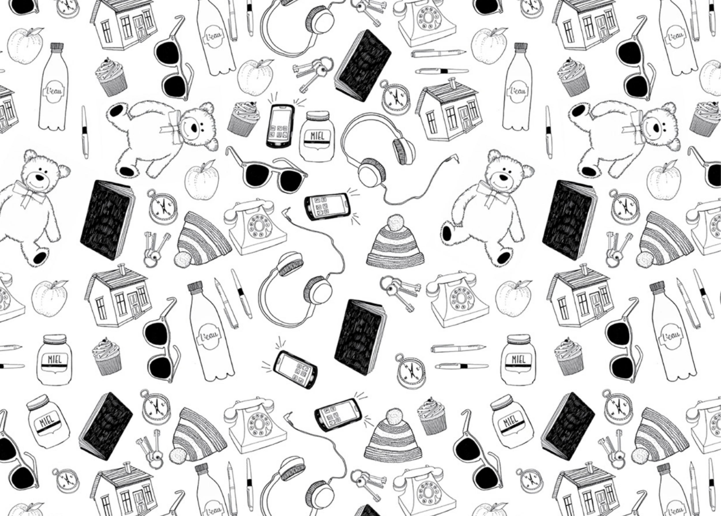
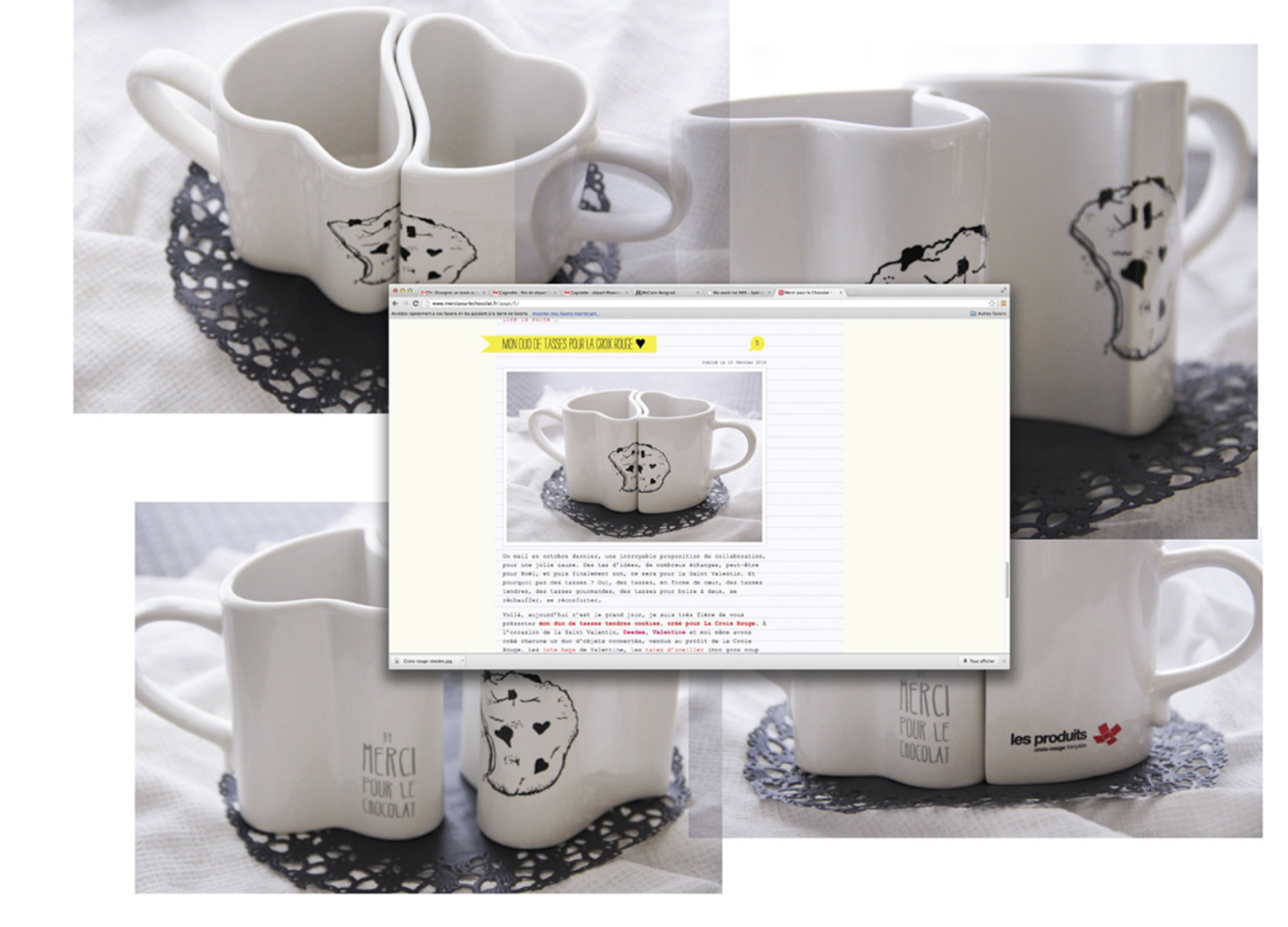
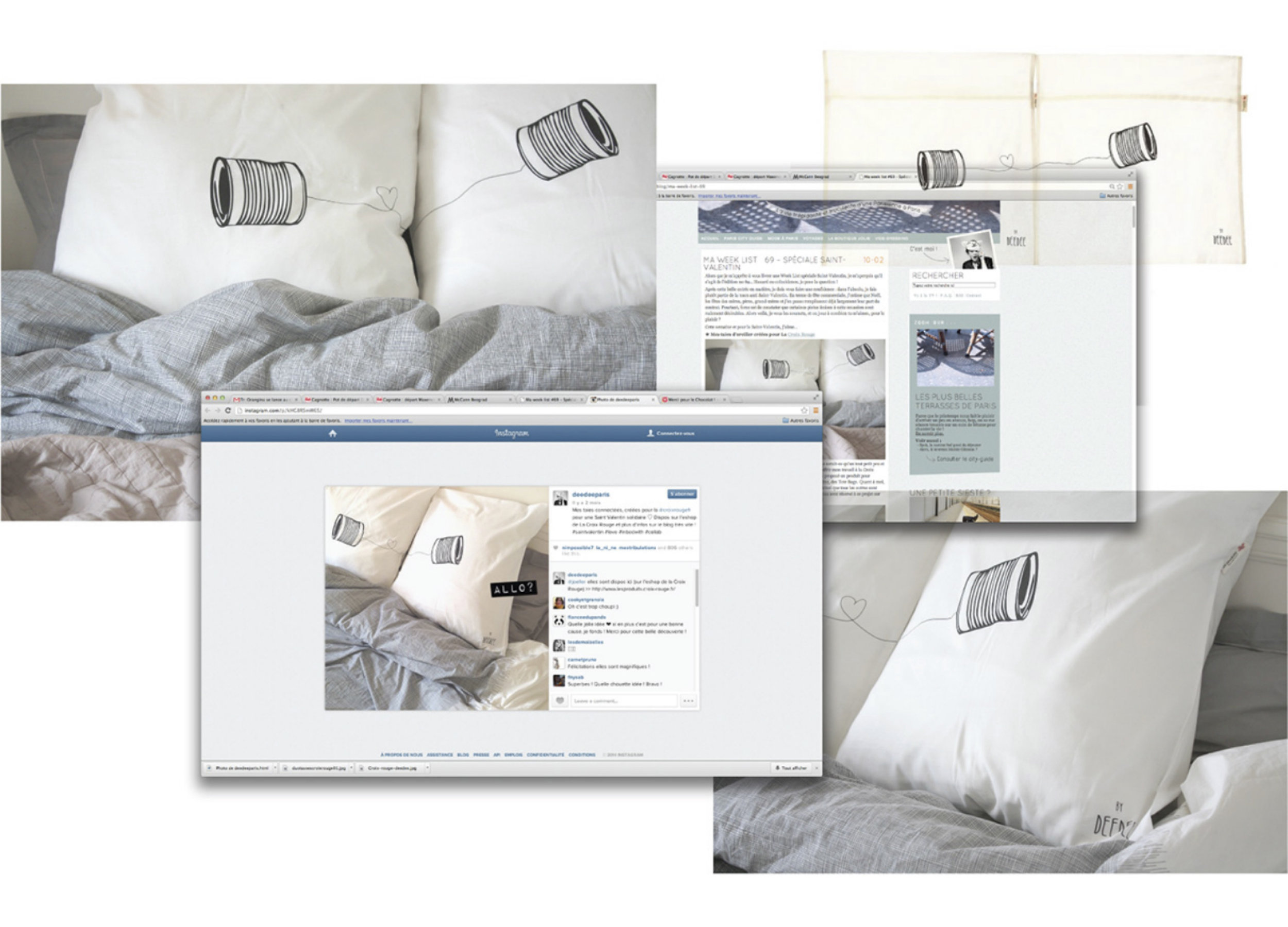
Whilst there are moments of utility in form and furnishing, brand identity, through lettering and illustration, offers something in the way of the personal, with a strong sense of place.
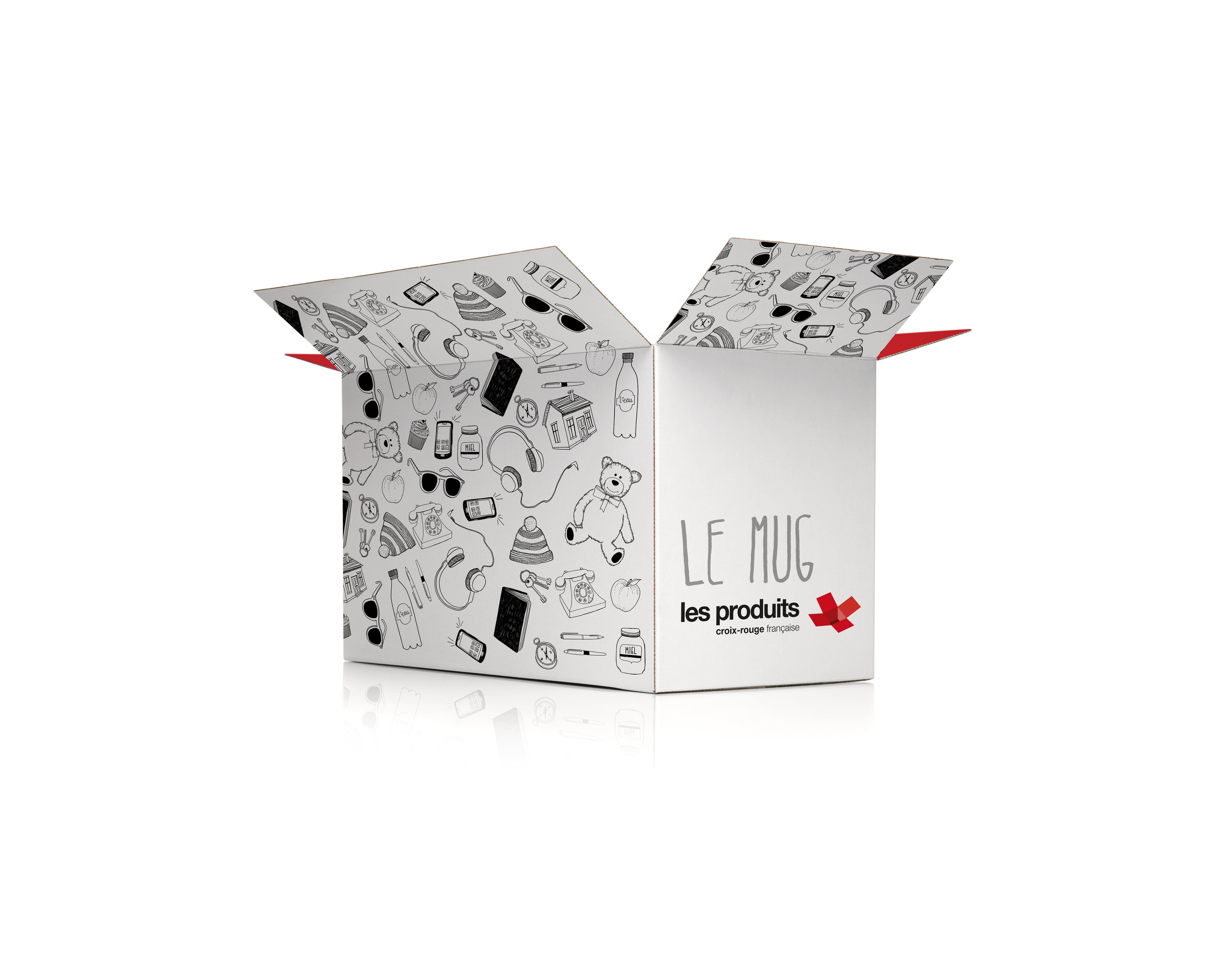
This approach to lettering is familiar but well-drawn, with a strong sense of the personal, which the illustration also shares with its loose irregular lines. Character work is idiosyncratic, often amusing in content.
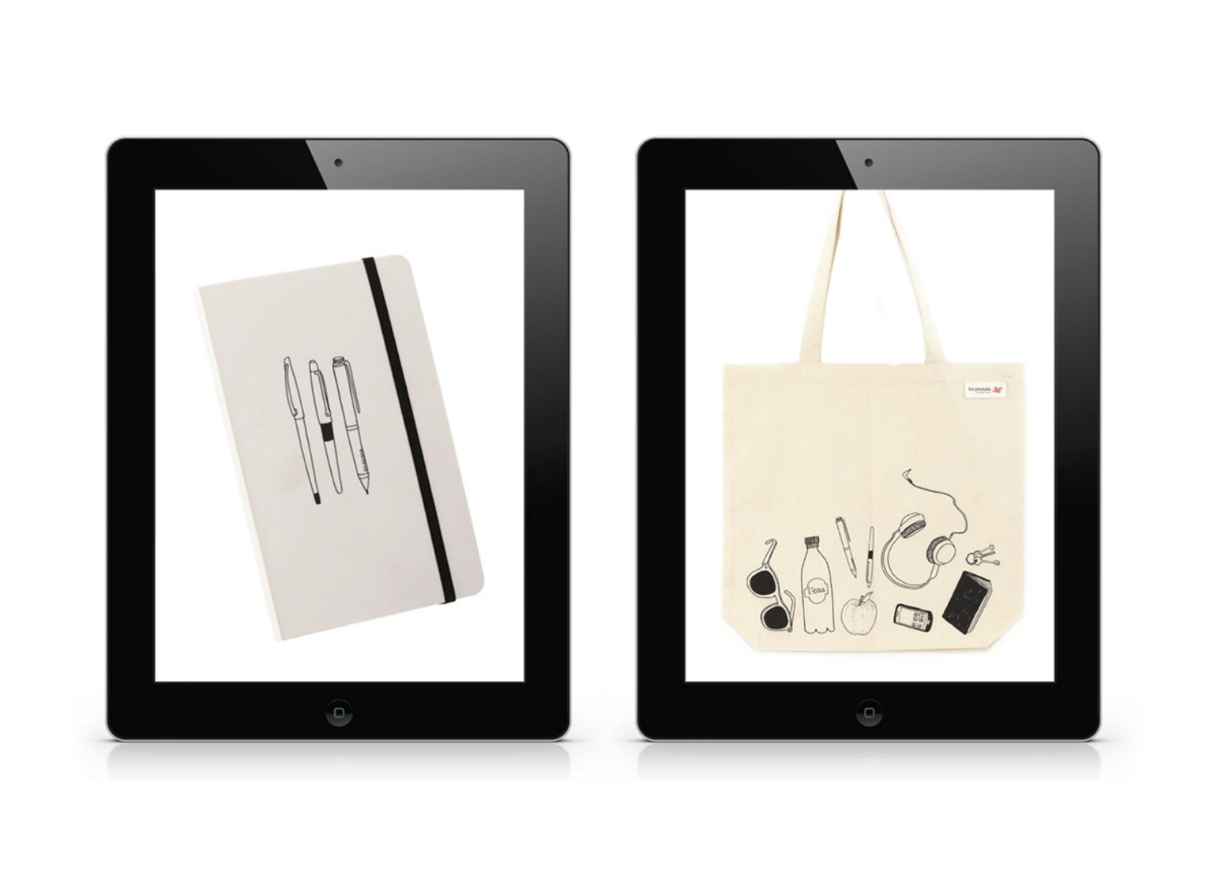

Taking spontaneous and rudimentary illustrations, such as the scribbles of a child, and wrangling these into something cohesive and high-end brings the brand into a very warm atmosphere.
